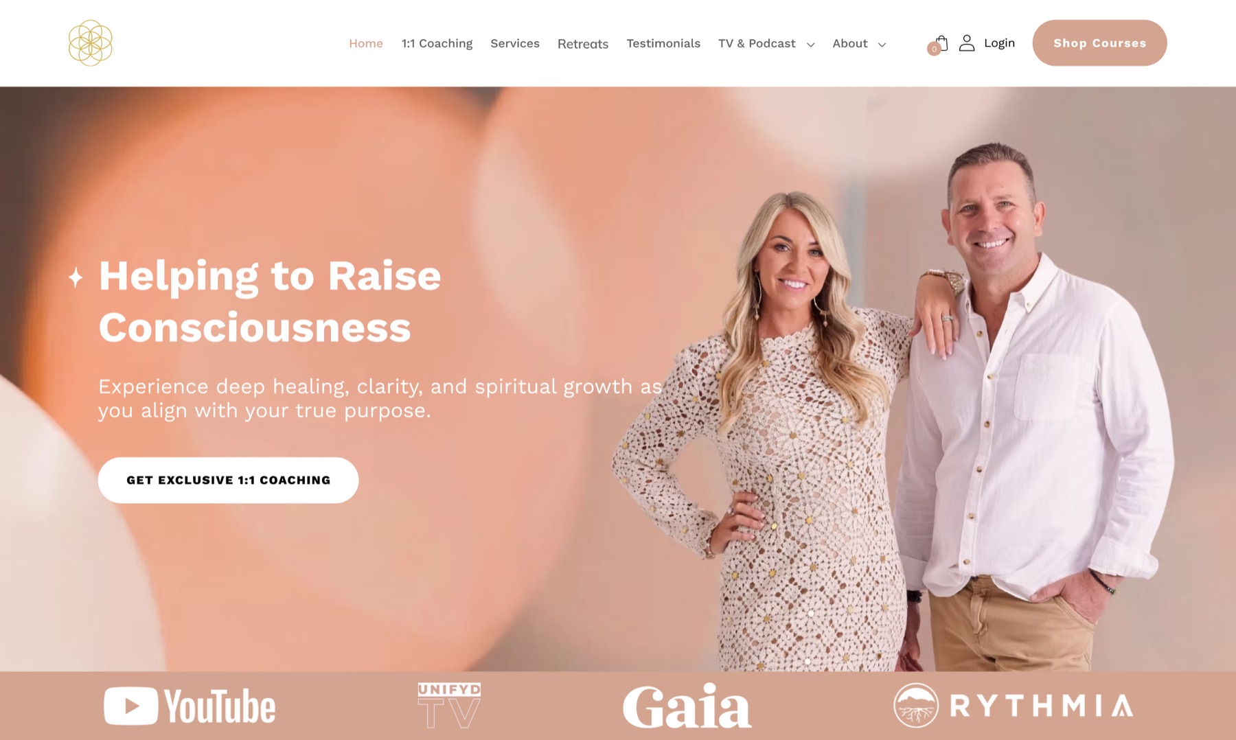
Awakening Education brings together coaching, courses, retreats, speaking, media, podcasts, and personal-development programs under one digital platform.
With such a broad range of offerings, the challenge was making the website easy to explore without overwhelming visitors. People needed to quickly understand who Awakening Education is, what they offer, and which experience is right for them.
Make it easier for visitors to discover coaching, courses, events, media, and other offerings.
Create a website that clearly communicates the breadth of the brand and supports enquiries, bookings, and program discovery.
Build a consistent visual and information hierarchy across a content-rich website.
Emily is exploring different approaches to personal growth. She is looking for trustworthy guidance, coaching, or educational experiences that align with her goals.
When a brand offers many ways to engage, the website needs to help people find their path rather than show them everything at once.
We approached the website as a content and discovery experience rather than a set of individual page redesigns. Awakening Education has many dimensions: coaching, education, media, retreats, speaking, and personal development. The main job was building a visual system that made these different experiences feel connected.
We focused on a clearer hierarchy between the brand story, core offerings, supporting content, and conversion points. The homepage introduces the purpose of Awakening Education first, then guides visitors toward the different ways to engage, while dedicated pages give more depth on specific services and programs.
The visual design was developed in Figma, with strong imagery, clear typography, consistent components, and purposeful calls to action. We then built the approved designs as a responsive WordPress website using Elementor, giving the team a flexible foundation they can keep managing and expanding.
The website had to hold very different kinds of content, from coaching and courses to documentaries, podcasts, retreats, team profiles, and educational resources.
The main challenge was staying consistent without making every page look identical. We created reusable design patterns and page structures, and let individual sections adapt to the type of content they present.
The build also had to stay manageable in WordPress and Elementor, so the design balanced visual ambition with practical implementation.
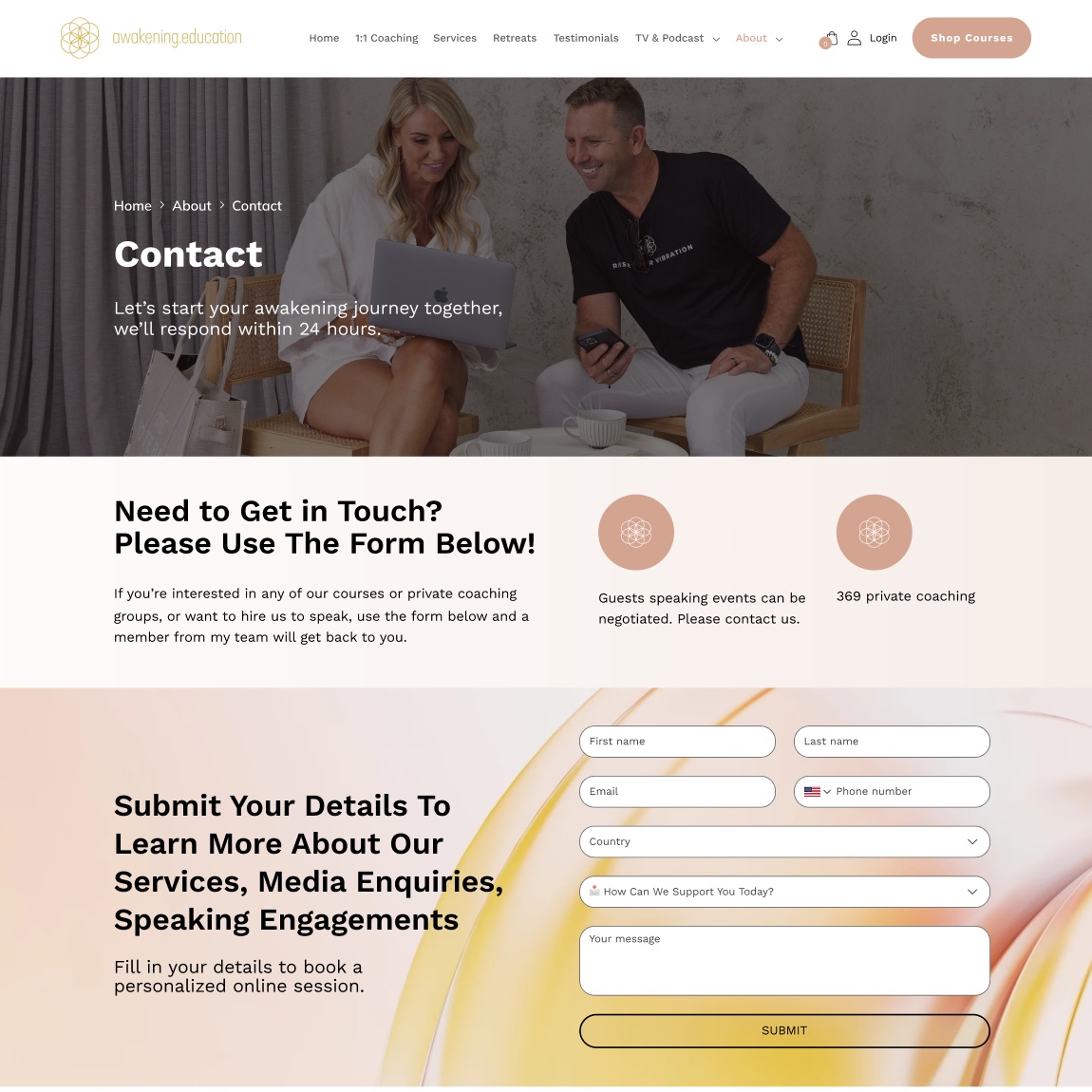
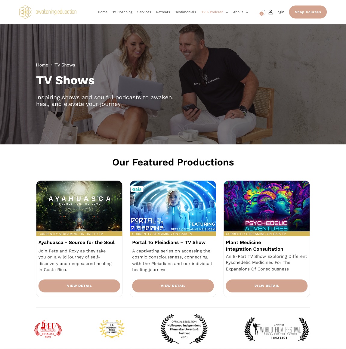
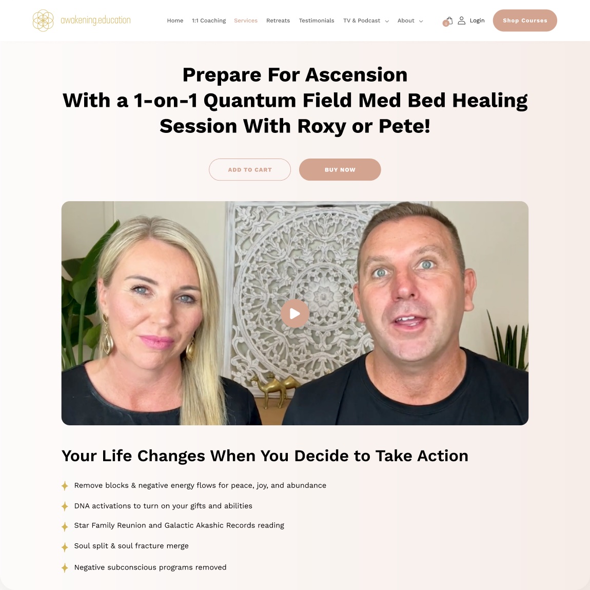
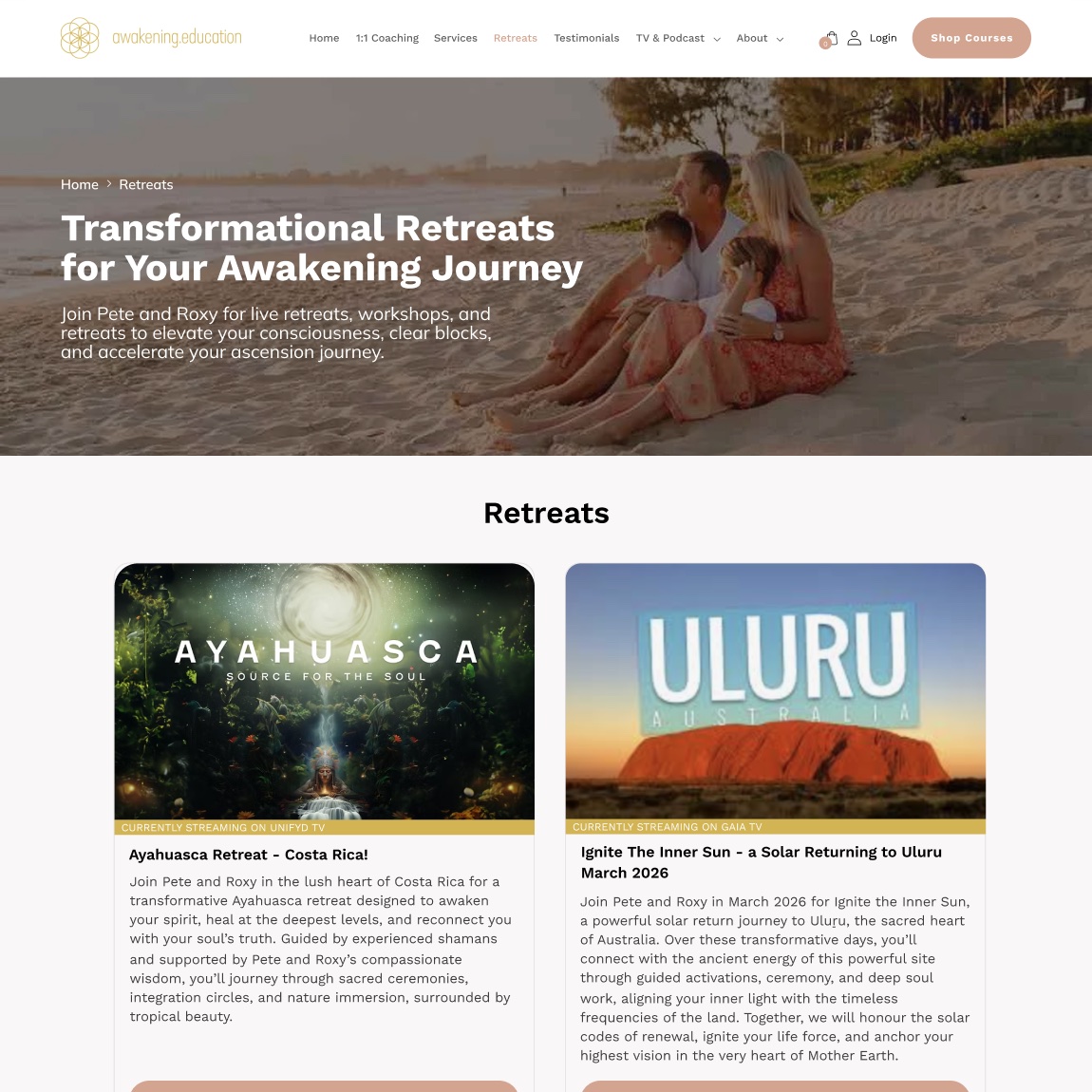
A clearer digital experience for a brand built around helping people discover a new path forward.